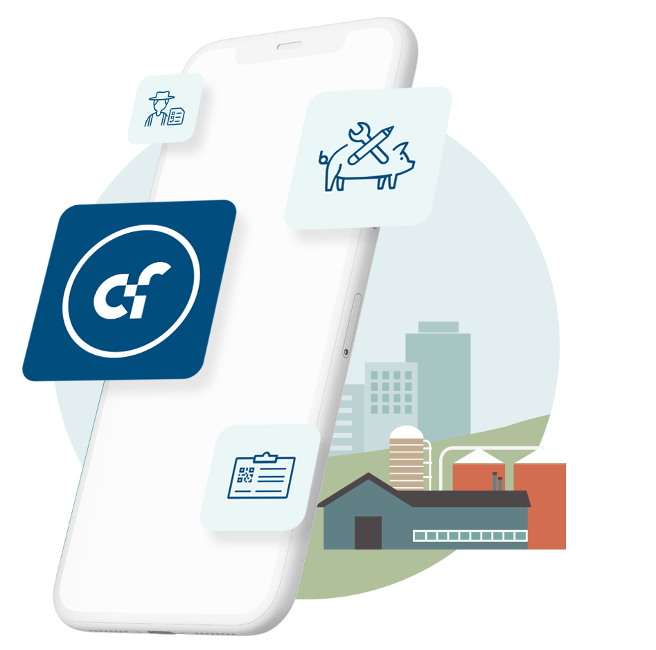
On July 1st, Cloudfarms will unveil a redesigned logo that reflects the company’s growth and mission to connect the entire pork supply chain.
 We are thrilled to announce the launch of our newly updated logo, which marks an exciting new chapter in the evolution of our brand. This new logo design builds upon the strong foundation established by our original logo, which was created by our co-founder and CTO Gregor Rayman to convey our company’s global reach and accessibility.
The new logo represents a modernization and refresh of our original design, showcasing the continued commitment to innovation and excellence that defines our company as a leading software provider in the industry. At Cloudfarms, we pride ourselves on being at the forefront of cutting-edge technology, and this new logo embodies the principles that drive us forward as a forward-thinking and intelligent software solution.
Our new logo captures the essence of what Cloudfarms stands for: a smart and innovative software solution that connects the entire supply chain, from production to external partners, to deliver the best possible services to our customers. It reflects our company’s core values of partnership, innovation, and excellence in everything we do.
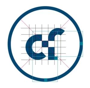
The two white and blue squares that comprise our new logo are symbolic of these values. Each square represents a counterpart that complements the other, demonstrating our commitment to strong partnerships with our clients and integrators. The square’s clean and modern design symbolizes our commitment to delivering smart and innovative solutions to our customers.
At Cloudfarms, we believe that our new logo not only modernizes and refreshes our brand, but it also captures the dynamic and forward-thinking nature of our company. We are committed to driving the future of pig management technology, and our new logo represents a visual representation of that commitment.